My next dungeon crawler - Minerva Labyrinth II?

After a much-needed few months away from game dev (and binging a lot of indie games), I’m getting back to work. I’ve been doing some tentative design work in spreadsheets for a little while now, and yesterday I started coding. I’m starting with some refactoring work and with my redesign of how stats work (also still tentative).

I’m not 100% settled on what this game will be about yet. I don’t think I’m ready to write a direct sequel to ML1, but I have some prequel ideas. I am also interested in returning to my tech fantasy setting, but a) I don’t have a good name for it or know what story I would want to tell in it, and b) the amount of new art I would have to create for it (especially all the player portraits) is daunting. ML2 makes the most sense right now, I think, so for now I’m moving forward with that in mind.

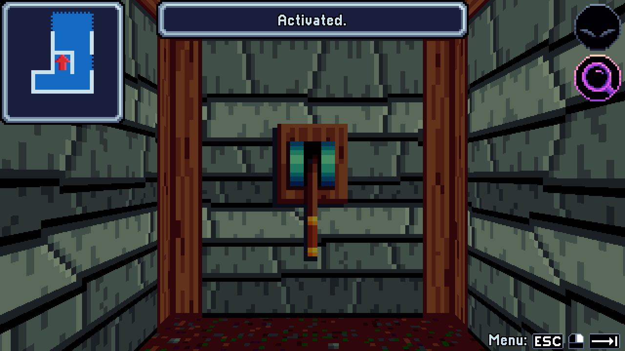
On the technical/refactoring side, I am starting with Godot 4.6 and am taking the opportunity to clean up and organize a lot of cruft that accumulated in ML1. An example is the workaround I used for enum dictionaries, which were poorly supported in Godot 4.2 when I first migrated from Unity. I scrapped that and replaced it all with basic dictionaries, now that they work better. I’m also making use of more resources to simplify item management. For example, I created an “item category” resource that stores an item’s icon, equipment slot, price modifiers, key status, etc. This way, if I want to e.g. update the icon for all broadswords, I only need to do it in one place. It also makes the item class smaller and easier to handle.

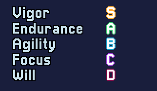
On the design side, I mentioned reworking stats. Stats in ML1 span a range from 3-15, but I didn’t make good use of that granularity. 4, 8, and 12 are the most important values since they are break points for equipment proficiency (itself a design compromise), and the point-by-point decisions in between aren’t super interesting. Even D&D has long had this problem. If you’re playing 3e for example, the only numbers you’re probably looking at when creating a character are 8, 10, 12, 14, and 16. Complication without attendant complexity isn’t really beneficial.

I’m experimenting with condensing the base stat range to ranks E, D, C, B, A, and S, as well as reworking equipment and stat bonuses. Derived stats like attack power will still be numerical. The idea is to put more weight on one stat rank vs. the next, but also to make stat allocation a bit more intuitive, as well as to reduce or eliminate break points that have a major impact on the character and can be hard to fully understand up front. This is still in flux because I’m not sure yet what works and what will best meet my design goals, but I’m getting closer.

While I was at it, though, I couldn’t resist implementing this little glow-up. I’ve also considered using stars (★★★★★) instead of letters for quicker visual clarity, but that takes up a lot more space, I don’t have a good star graphic or unicode ready, and these labels aren’t currently set up for rich text. Options open, though.

Vigor, Endurance, Agility, Focus, and Will stats, ranging from D to S.  The letters glow dull red, violet, blue, green, and yellow for D, C, B, A, and S, respectively.

i think in games like rpgs this somewhat troubles me because it abstracts away the specific relationship each rank has with each other - like, how much better is S than A?

If i have to make a bunch of concessions on my build in other stats to get an S in something, or it takes a ton of time/effort to upgrade to that rank, how much did i actually trade off for, was it worth it?

possibly if the goal is to simplify the thinking, maybe something like a base stat number is still fine, and items are something like percentages, like if this axe scales 120% with STR then i know intuitively that it will work well for my STR focused characters, but its less important to know the exact stat value each char has

What the stats actually do is still concrete and transparently communicated, hopefully moreso than in ML1, if anything. An A rank in Vigor will increase your attack power by (say) 60%, for example. It’s just represented by a letter instead of a digit.

I’m doing a lot of experimenting with stats and equipment right now, so I’ll talk more about that once it’s more solid. In the mean time, here’s something I did on Saturday. Until now, the map did not scroll, so I was limited to 16x16 maps, as that was what I could fit on the map screen. This ended up being a tight space to do everything I wanted, and I think the levels being so compact made it too obvious where the secrets were. Now, I can make them as big as I want. I’m thinking 24x24 or maybe 28x28. The key is that I don’t HAVE to fill all that space. With 16x16 I made use of nearly every square, but with a bigger workspace, I can make not only bigger levels, but levels of different sizes and shapes. I can have bigger open rooms if I want, and I can leave unused space to create more uncertainty about what’s around.

There are some other, probably tricky upgrades I’m thinking about making to the map system, but this was the most necessary, so it’s a good start.


More map upgrades! This time I’ve refactored the way map data is generated and loaded to allow viewing the map for any known level in the game, not just the current one. This was my other big to-do item regarding the map.

In ML1, when a level is loaded, the automap controller parses the relevant geometry directly from the level and uses it to generate the map at runtime. Since most of that data is easily portable, I created a new data class to store just the consolidated automap data from a level. The data is lazy-initialized and stored the first time the level is entered or its map page is accessed. After that, it remains in memory separate from the level itself, and can be loaded and viewed any time.

Where this gets a bit problematic is with the state changes that can alter the map. Due to Godot’s clumsy handling of custom data classes, I implemented these as physical nodes attached to the dungeon objects that they control. I didn’t want to have an arbitrary number of such nodes sitting in the hierarchy just to occasionally fidget with the map, so I implemented a way to package up the check functionality and pass it around internally. It’s a bit messy, so I have some work to do on improving that implementation, but it works - you can flip a gate switch in one level and see the corresponding gate open on your map in another level.

In the future there are more upgrades I’d like to make to level loading and complexity, but I don’t know if they’ll be in scope for this project.

Video: Shop GUI enhancements

Not sure of the best way to link scratch-work videos off-site. It’s kind of a pain to put this up on YouTube. Is there a site that can be embedded properly here?

I have a lengthy to-do list, so I’ve been bouncing around working on whatever interests me. It’s fun to get back into this mode of development, versus the long testing and polishing crunch of last year. Today I’m working on improving the shop interface with a “buy and equip” option and a less cluttered quick preview window. This is actually kind of difficult to get right, as far as implementing what is most ergonomic and intuitive (e.g. where in the process to put the “equip” step) without sacrificing necessary detail. In cases like this I like to reference other games to see how they solved it. That helps, but a lot of shop interfaces still tend to be missing some important information, or just print it in a very tiny font.

It’s important to me to be able to see as much detail as possible in the shop window - it’s frustrating in RPGs when you can’t really see what you’re buying - but I’m trying to organize it better. In ML1, the panel on the right shows as many stat comparisons as can fit there. This is kind of hard to read, especially when comparing across weapon types. I decided to simplify it to just an up or down indicator and the currently equipped item. The indicator is mainly based on item tier and rarity, so any generic tier 2 item will show as an upgrade to a generic tier 1 item, for example. However, this is just meant as a quick signpost and visual aid (I call it the “quick compare”). The “buy and equip” feature shows a full breakdown of stat deltas in a table. This is all the same information as before (in fact, it can fit more stats at once - up to ten or twelve, I think, which should be enough for any item) in a hopefully more legible format.

I decided to not try to show deltas for multiple characters or support buy+equip of quantities. I think that if you are buying multiples of a weapon or armor, you already know what you want, so it’s probably not worth the extra work and complication.

One thing that is a bit sticky is two-handed weapons. ML1 does not have these, but I’m planning to add them in ML2. The trick is what exactly to display when comparing a two-handed weapon to a weapon+offhand. The full stat comparison is easy enough, but what equipped item names do I display? Ideally I’d show both, but space is a bit tight, especially on the right side. For now I have it displaying (and calculating the up/down from) the better of the two items, although the stat delta shows the combined totals. To display both, I’d probably have to either accept some item names getting cut off, or come up with abbreviated item names to use in tight spaces.

I chose to cancel back to the purchase mode selection after confirming a buy+equip. The reason is mainly that I think the screen needs some kind of friction there to prevent double-clicks. There are a few ways to do that, but judging by ML1, the player is probably only buying one item anyway most of the time, so friction in this form will actually save a cancel press a lot of the time. ML2 rules will be a bit different, though, so I can adjust if it ends up being annoying.

In playing with this a bit, it seems to work well. The quick compare gives me an easy indication at a glance of which items are most worth looking at and who particularly needs an upgrade, and it’s also now clear what a character is already using. If I want to buy a new greatsword, I can tell right away who I probably want to give it to. Then, the stat breakdown gives me the full details that I need to decide if it’s worth a purchase.

I’m continuing to work on my wish list. Nothing exciting enough to screenshot, but here are a few things I’ve been doing:

  • Item enchantments. I can now support adding a modification to a piece of equipment to improve its stats or potentially add other effects. I don’t have an interface for this yet and I’m not even sure I’ll use it in the game, but it was fun to implement, and restructuring the item code to support it has other benefits.
  • Encounter design improvements. I can now define random loot tables for individual enemies and define different random encounter sets for different parts of the map. In ML1, each level had a single encounter table, and any items dropped by enemies were hand-placed in fixed encounters (so random encounters never dropped any).
  • A quick “equip” option on the inventory screen. I often see players trying to do this, so I may port this change back to ML1, though I’ll have to consider how to communicate equipment weight there (I am tentatively removing weight in ML2).
  • A lot of refactoring work to clean up my character controller class (reduced from 2900 lines to 1700 so far). Not visible to players, but should make my life easier.

Video: Enchanting items

Here’s a first draft of the enchantment mechanics I’m working on. The idea is that one piece of equipment can hold one enchantment out of several options depending on its equipment slot, and these enchantments are paid for with uncommon materials (gem dust). The goal is to add a bit of extra gear customization and in-tier progression/decision-making. You won’t be able to purchase current-tier dusts, so they would be itemized in the dungeon or rarely dropped by enemies. It’s an alternative to just placing another weapon or shield, and one that is more flexible in how it can be employed.

This is just an idea at this point, so I will have to playtest it to determine whether it benefits the game, what enchantments should be available, and how best to integrate it into the game loop.

The layout of the screen took me a few days to work out. It essentially functions as a shop, so the existing shop menu was my starting point, but the flow and required information is different. Of course, I’ll adjust as needed once I’ve playtested it.

I’ve added support for difficulty settings, something that didn’t make it into ML1. This is again just a rough draft at this point, since it will take playtesting to decide which adjustments to use and how far to push them. Encounter size is one of the trickier ones. I can add or subtract certain enemies from an encounter (fixed or random) based on difficulty, but I set it up so that doing this doesn’t affect the rewards from the encounter. The reason is that I think leveling slower and collecting less money on lower difficulty or the opposite on higher difficulty undermines the purpose of the difficulty setting. In practice, though, the added or lost XP might not make a noticeable difference, or it might make some encounters feel less rewarding than they should. I guess we’ll see.


I also updated my character portraits. When I was prototyping ML1 5+ years ago, I made the portrait components (face, hair, eyes, jewelry) out of individually-colored sprites. When I eventually added more options and the color-coded transformation sparkles, it was a hassle. To add a new hair color, for example, I have to add a new frame to each hairstyle in Aseprite, use Aseprite’s very finicky color replacement tool on up to three layers per hairstyle, export the sprite sheet, reimport it into Godot, and update three atlases with the new color. Likewise, if I want to add a whole new hairstyle, I have to create a version of it for every existing color.

So, I replaced the multiple colored sprites with single greyscale sprites, and wrote a simple color replacement shader. This way, I can eliminate all of the redundant sprites and manipulate a character’s palette with just shader parameters. This really cleans up my Aseprite workspace and will make it much easier to experiment with new colors and models or potentially even new components. Drawing a new sprite is one-and-done, and new colors don’t even need any sprite work. I should definitely have done this ages ago, but nothing’s as permanent as a temporary solution.