let’s talk about pixel art! share what you’re working on or illicit some feedback. this’ll probably get stickied, so feel to come back here if you got something feel free to bump again - no worries about the thread going stale or anything.
here are some of my recent-ish exploits
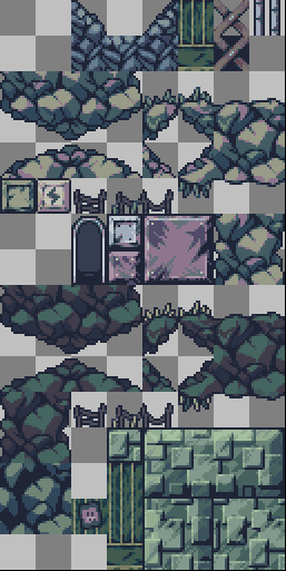
this is some tileset art i did (honestly a while ago) - where I was studying a lot from cave story at the time. it’s definitely a little different overall, particularly since i’m using an outline color. the tiling background art though I think cuts it very close to the original. these did end up in a little unreleased game just for me to see how it sort of looked as a whole.
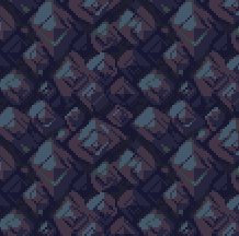
more recently I’ve been trying at it again, for yet-disclosed reasons. I’m really not used to working without a dedicated outline color, so when i tried it here I think the rest of the palette ended up feeling a bit unbalanced (not enough contrast?). at this point i definitely have my own personal style that influences color theory, but it doesn’t feel quite like it calls forth ‘16 bit’ yet in the way cave story does ahaha.
probably my favorite thing about the study was this dust/smoke particle, which i’ll probably recycle into other things
these look gorgeous! i honestly like the lower contrast look, the set feels soft and nice on my eyes if that makes sense lol. great particles too, and everything feels cohesive. i def think your style stands on its own but the tiled bg did remind me instantly of cave story, but that’s a good thing i’d say! looks great
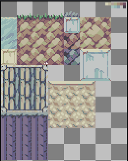
I like these a lot, especially the lower contrast tiles. They almost remind me of Kirby’s Dreamland 3 with its more muted colors, but I think they definitely have their own unique feel to them.
your tilesets are good looking. i like how geometric they are, and the way you use diagonals in your “dirt” tiles is interesting to me. i don’t see that often. the pastel-y palette in the second one gives me strong SNES vibes as hue mentioned before me. i would eat a game that looks like this! (don’t ask)
Your tilesets slap. I really like the colors of the first one. Working without outlines is great for a more natural and clear setting, being able to separate different elements with hue and contrast is hard but very rewarding.
Appreciate the response everyone! excited to see if you all are working on pixels too
I think this is what I was getting at when I mentioned I still needed some thought for the colors. I definitely don’t dislike how the colors feel overall, but i know its important for games without outlines to really make sure things like characters and enemies stick out from the environment
I think its just one of those things that you really need to adjust around in an actual application, or at least a mockup
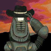
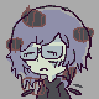
This is one of the more impressive things I’ve done recently with spritework, I suppose. A friend who works at Obsidian commissioned me for a new icon of his favourite New Vegas character Primm Slim.
I’ve been really getting into dithering lately - Aseprite makes it just so incredibly easy to use and I adore the texture it adds; the animation was just kind of whatever, I don’t consider myself a sprite animator and have few aspirations to learn it.
Colour was also difficult to pin down with this one. I’m happy with the end-result, but any critiques would still be welcome!
it’s been a long time, but i’m reviving this topic! pixels still need to be pushed! put in their place.
specifically, i’ve recently been trying my hands at animation more. pixel art animation and i used to not get along at all; i’d put off doing any of it as much as possible, but that needs to change now.
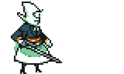
thanks to an acquaintance, stem, i got some good intel on how to make a nice-looking stabbing-animation for a character from BLANKSWORD:
here it is slowed down, so the frame-by-frame is more visible. (i do see a small mistake on the wings on this now, but… whatever… )
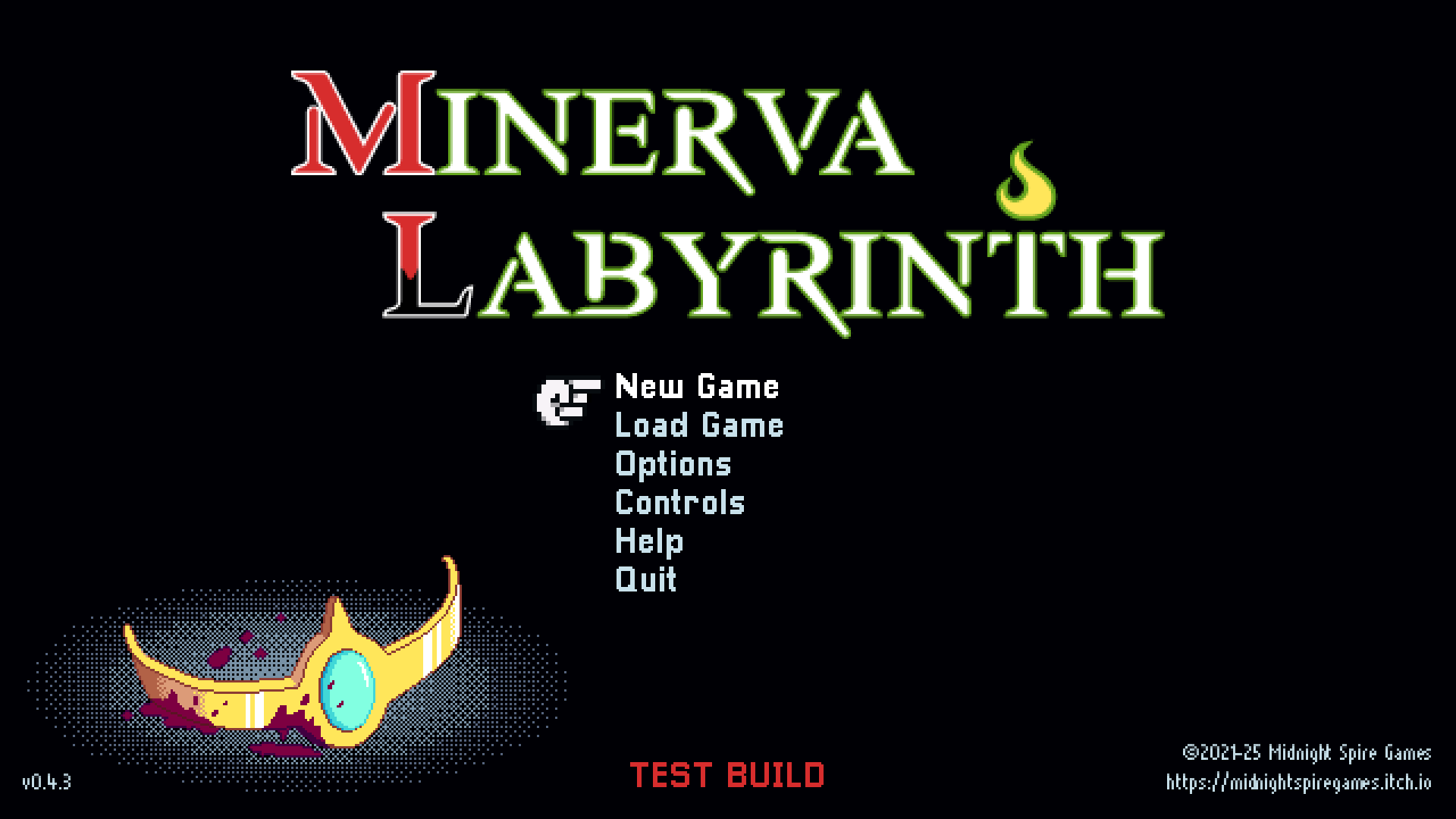
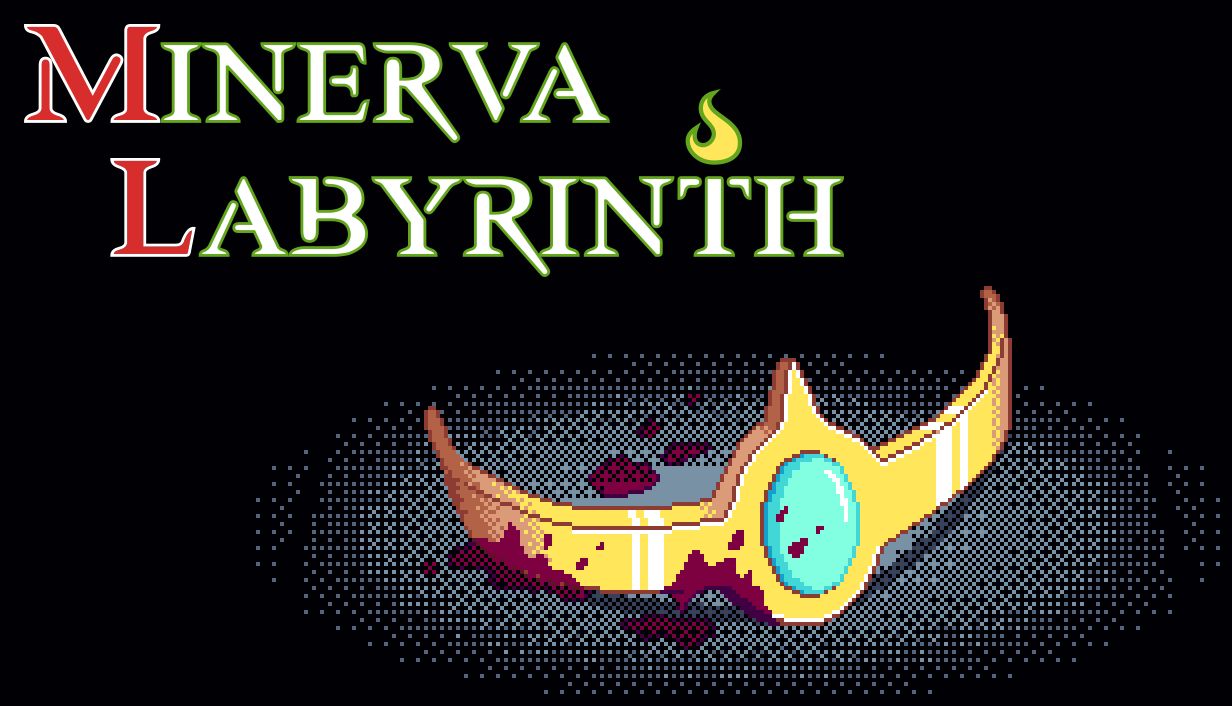
Some art that I’m messing with. Was hoping to make an image that is usable for Steam capsules (I don’t know if it is yet), but I thought it could work on the title screen as well. It is actually higher resolution than I typically use for GUI sprites, but so is the title banner, so the main menu is already cheating, I guess.
I sketched a few variations of this, but this was the only one I could get even close to right.
Nice! The T turning into a candle holder is a good detail. I’ve never arranged one myself but as I understand the trick to steam card art is to have a number of composable parts you can position around easily against the background. They require art at about 12 different aspect ratios for different areas of the site, so being able to just sort of slot in the key art + the title over the background in different spots makes it go quickly. I think this combo makes a lot of sense where the art can be offset from the title in landscape, but for a portrait “box art” ratio will align vertically centered perfectly too. If you feel like you need something to break up the background a bit more something like light shafts on the crown could be a nice addition
Yeah, it’s totally ridiculous. I would happily accept slightly less fancy and dynamic Steam visuals in exchange for not burdening developers with this nonsense. It’s just a shitty DRM launcher, who cares??
Anyway, the crown is still WIP, but I’ll probably take what I have and see if it’s workable as capsule art this weekend.
yeah absolutely. it’s purely work they put on devs in order to maintain their own brand integrity, with the sell that it will somehow help your game out in the end “for the health of your store presence”. I think we’re a bit past the point where anyone still believes steam is doing indies any favors lol
Probably final, or close to it. I made all of the capsules some permutation of this. I guess it worked out well enough, at least without seeing how they actually look in the store.