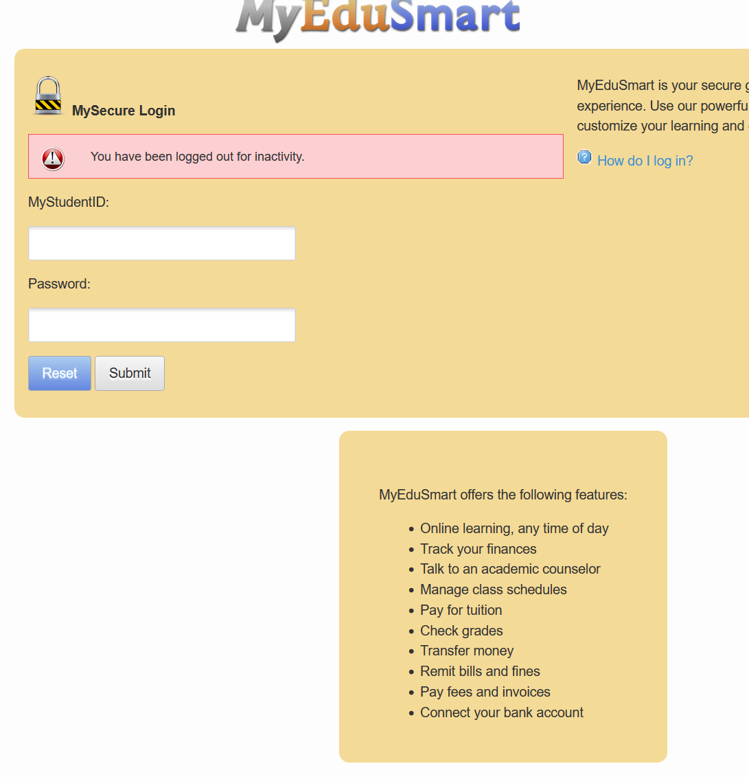
The goal of MyEduSmart is to find your grades in the worst college website ever created.
(There are no ARG or horror elements in it, it’s just a lot of jokes.)
Tech stack
Unsurprisingly, MyEduSmart runs in the browser. I decided to use a modern frontend stack: Vue.js, TypeScript, Vite, and Tone.js for audio. I’ve generally been a skeptic of the frontend ecosystem but I actually really like Vue. It would have cost me a lot of dev time if I had stuck with jQuery or something.
One deliberately non-modern decision is to avoid CSS frameworks like Bootstrap. This is because I don’t want any framework giving automatic professional styles for elements, and forcing myself to code all the UI from scratch gives more authentic and hopefully funnier results.
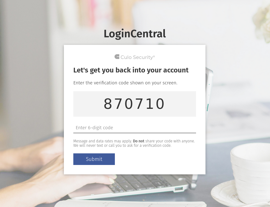
There is no backend here, it is all just static assets, and hosting the game requires only a static file server. It all fits in an iframe on Itch. There are a few instances where more unusual browser features are employed as jokes in the game.
Graphics

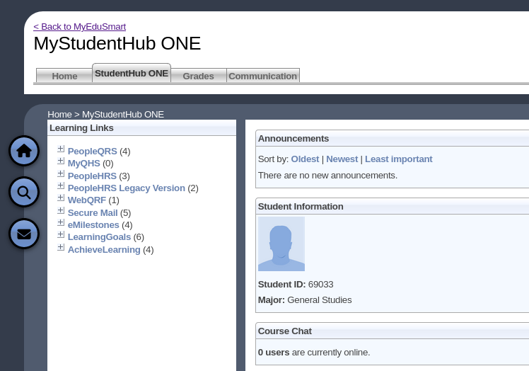
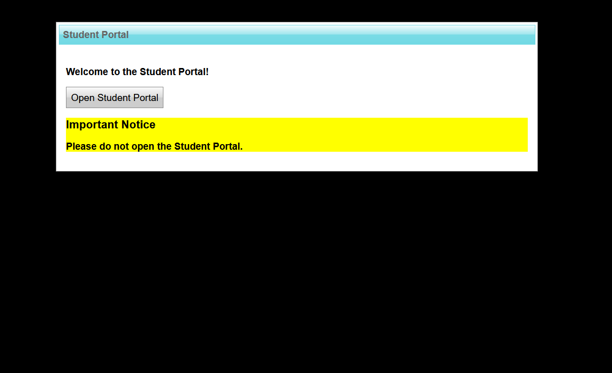
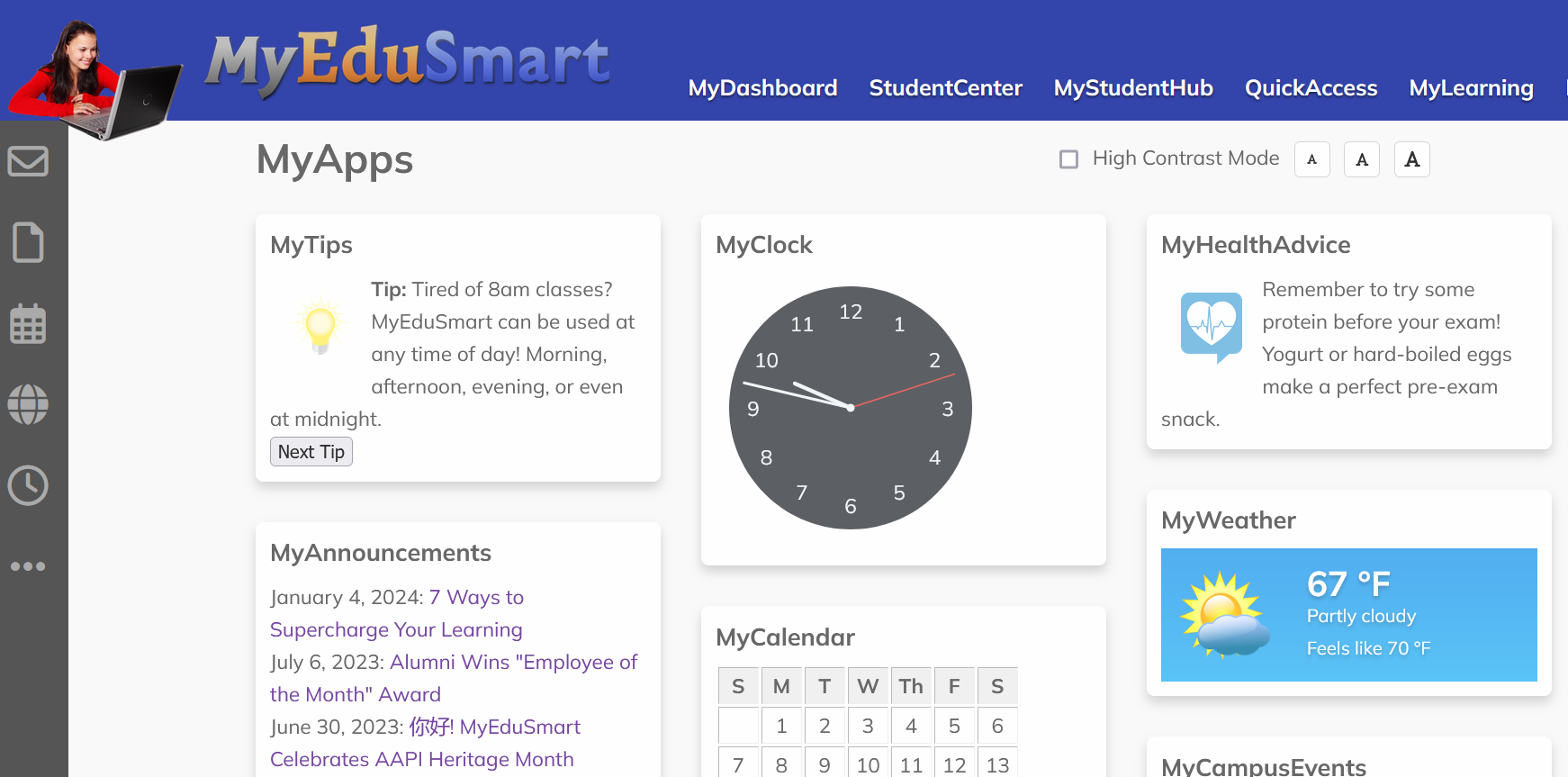
There’s a certain look to school websites from different eras that I’m going for here. There are a few parts of it that look dated and amateurish, but I try not to use that as too much since it can be a crutch. It often tends to be funnier when the site design is modern, professional, and utterly soulless, and the humor is delivered more through behavior and writing. More importantly, the design philosophy here is to look inconsistent, rushed, and either under-budgeted or over-budgeted.
I have a big folder full of reference screenshots (some sent over by friends from their work and school websites) that I’m still mining ideas from. I have no idea what I’m doing with CSS and have no professional web or graphic design experience, which is almost a plus here.
Vue 3’s “single-page components” and scoped styles proved particularly nice for this project because I can define completely different CSS for each part of the game. This helps sell the notion that MyEduSmart is a dozen or so incompatible services from different teams stapled together.
I grab a lot of assets from OpenClipArt, Pixabay, and Pexels. FontAwesome and Material for icons. Lots of Google Fonts too. Tip: if you plan on using Google Fonts, use google-webfonts-helper to download and self-host them.
Writing
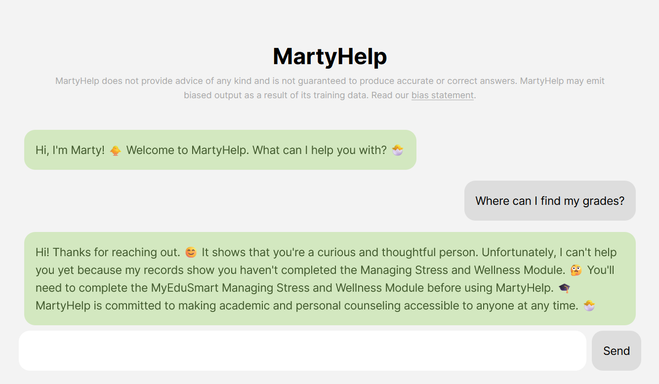
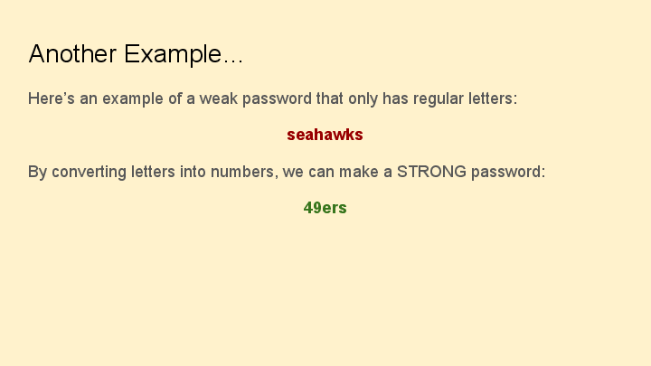
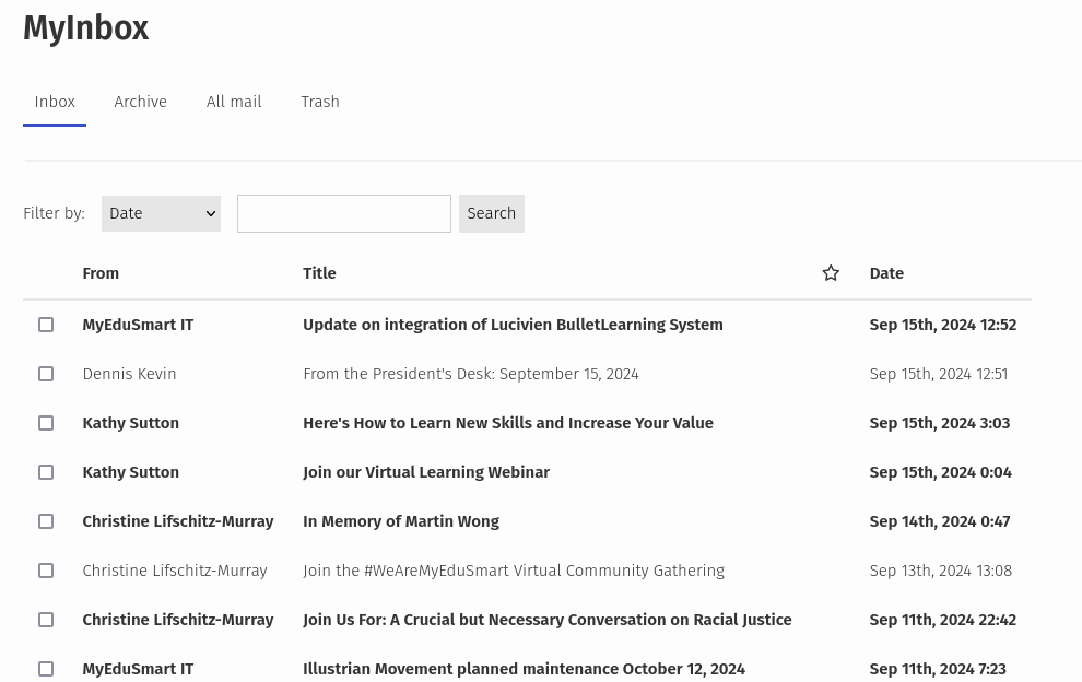
My vision for this game is 90% Easter eggs. Anything you click on should have a dumb joke. There is in fact a plot to the game, which gradually plays out over the MyInbox messaging system and the “virtual assistant” chatbot MartyHelp.
My most recent milestone was making it possible to play MyEduSmart start to finish. The original concept was that the game ends when you find your grades and your “grades” are just the statistics on how quickly/efficiently you finished them, but that felt anticlimactic, and the current ending is much more bombastic and fittingly absurd. But even if someone just clicks around for 15 minutes and laughs, that’s a success in my book.
Background
I had the idea around 2017, and I was in community college at the time. When COVID hit and the “e-Learning” industry exploded, MyEduSmart became so urgent that I couldn’t not make it. I really buckled down and officially started the project in August 2023, and I’ve been working on it on and off since then. It’s mostly a solo effort, but I have one other person who’s contributed a lot to the “learning modules,” which we make in Google Slides.